SPOTIFY REDESIGN

What Spotify could be
Spotify is a service that i use pretty much every day. I like it and I do enjoy using it, as it provides a common space for most of my audio needs. But ever so often I do feel like it could really benefit from some Usability enhancements here and there. I understand that Spotify tries to cater to a huge amount of people, all with different needs and listening habits. Therefore my redesign was created to serve my particular needs and fix the issues I had with the service.
For More Visual Clarity
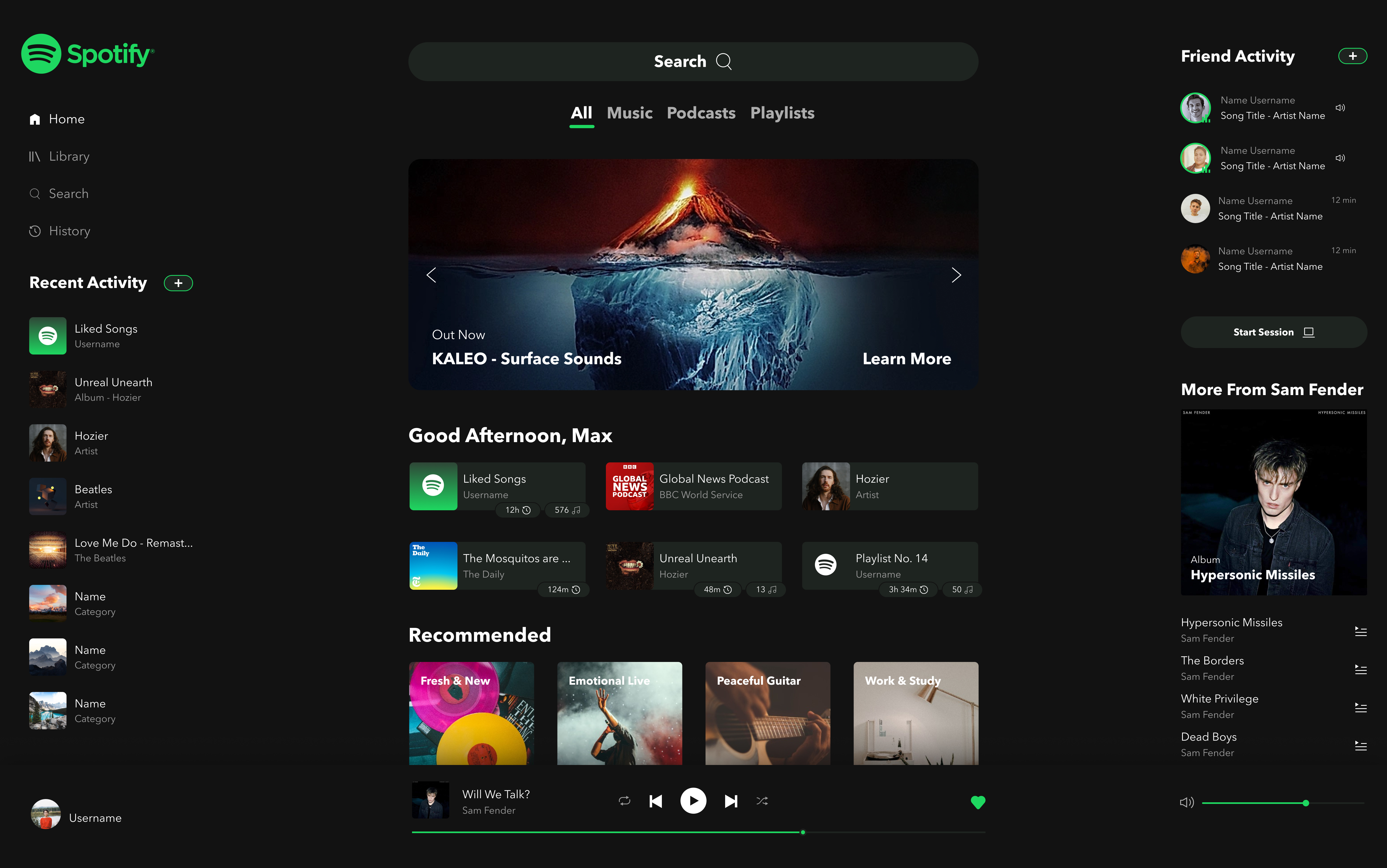
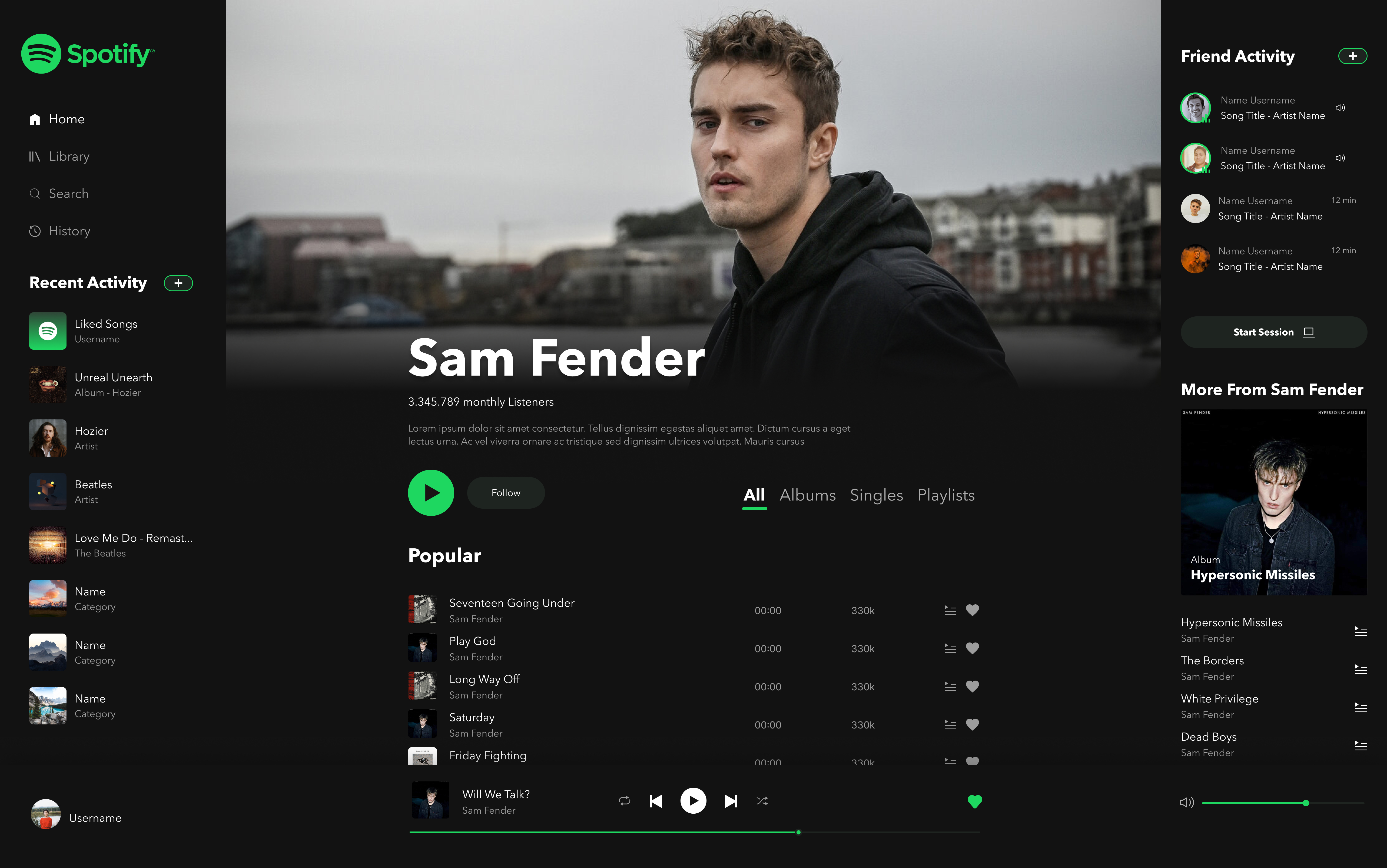
First and foremost i felt like Spotifys Front Page could profit from a little bit more visual distinction between the different kinds of content. Everything looked kind of the same, be it Albums, Playlists, Singles, Podcasts and so on. They are all presented in the same or similar manner. A typical card with picture and title. To highlight this you can see four different kinds of media in the image below, one Podcast, one Single, one Album and one Playlist.
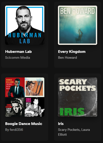
You can probably tell which is which, but the problem arises when the entire front page of Spotify is filled with these kinds of cards. For me it lacks visual clarity and I would like to see different styles of presenting fundamentally different content.
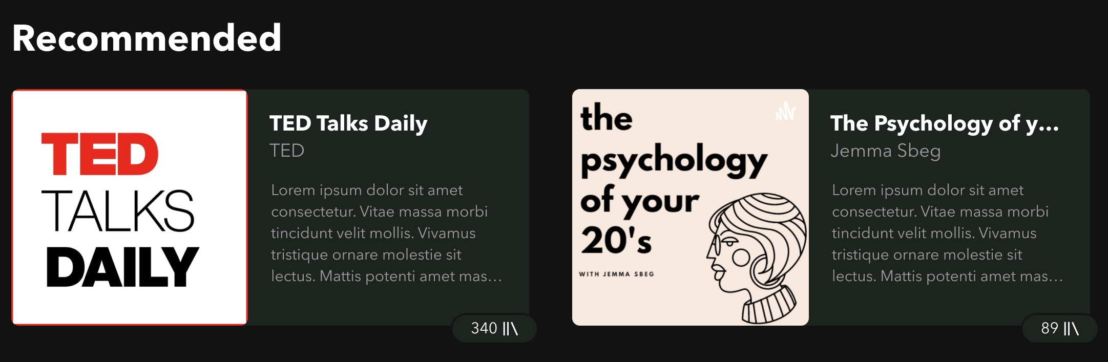
For example, recommended podcasts in my design are presented in a large, horizontal card, with some information about the podcast itself, so you do not have to rely on thumbnail and title alone.
Curated Content, like playlist and recommendations of all sorts are also displayed differently. As you can see in the “Good Afternoon” section, the items are smaller. These are the items that you are already familiar with, things that you have listened to recently. Therefore, they do not need as prominent of a presentation to peak your interest. Other items like recommended podcasts or curated playlists take up more screen space, as these need more of your attention to process.
The different elements are also designed in a style that translates well to mobile, as with the smaller screen items could simply be stacked on top of each other.
Finally some proper Content Filtering
As far as functionality goes, I have also implemented some changes to the interactions. Keeping with the problem that content lacks distinguishability, I wanted users to have an easier time browsing specifically between different kinds of content. As of right now this does not seem to be possible… something i really cannot understand. I have introduced categories underneath the search bar, that allow a quick and easy way to select the content you are currently searching for. It all happens on the front page and all your favorite music, podcasts and playlists are just one click away

Contextual Menu for Music and Podcasts
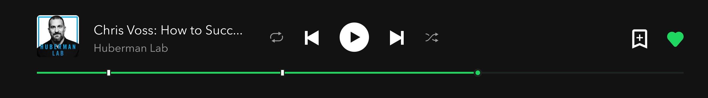
I also included a new section on the sidebar that displays contextual content, based on what you are listening to. In case of music it would show more songs from the artist or playlist you are currently listening to. From there you can also directly put some songs your cue. The benefit of this is that the main window remains untouched an you can continue what you were already doing, while simultaneously cueing more songs.
In case you are listening to podcasts, you can now see the different timestamps from the episode directly in the context menu. There is no more need to change the main window to the page of the specific episode, scroll down and expand the description to pick the correct timestamp.

I have also imagined a feature that would allow users to place timestamps of their own during an episode. When listening to a podcast an icon will appear near the timeline that, when pressed, will mark a specific moment in the episode.
Some Visual Changes
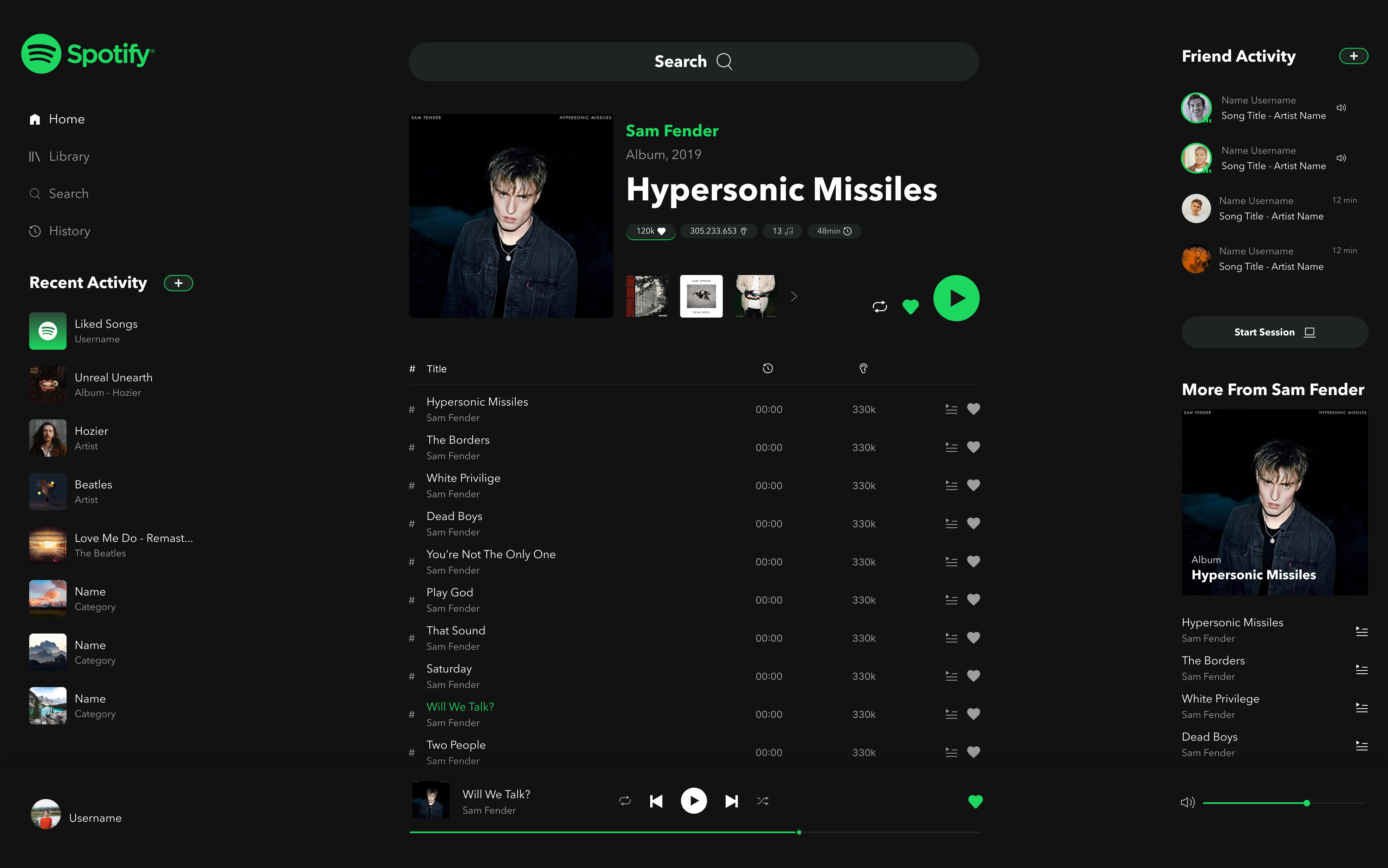
Apart from that i have also implemented some minor visual changes to the UI that would fit the aesthetic i have chosen and contribute to a more coherent whole. I have chosen to redesign the artist view and the album view. There is not much to say here, as I do not have many complaints about the originals. It is simply a visual overhaul. Enjoy!
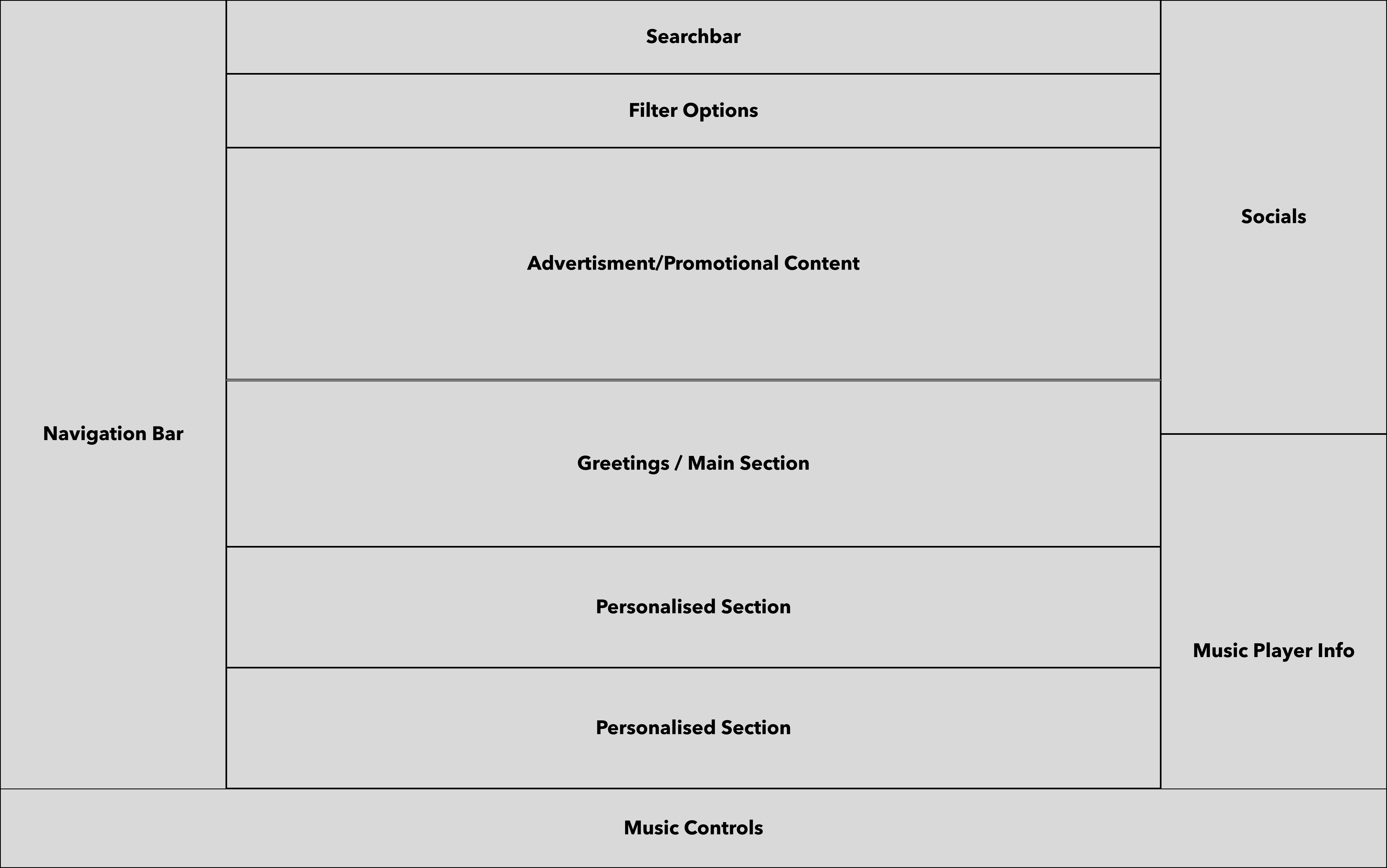
Mock Ups and Wireframes
Here are also my initial Mock Ups and Wireframes that preceded my final design. I started by dividing the screen into different sections and went on to create a more fleshed out Mockup. As a tool of choice i used Figma for everything you have seen so far.